Module Housing iOS Mobile App
Transforming Home-Buying: A UX Journey Enhancing Module Housing's Experience Through Strategic Design Iterations.
Tools
Figma, Squarespace, Procreate, Whimsical, Notion, Trello
Methods + Approach
User Research, Affinity Mapping, Card Sorting, Personas, Journey Mapping, Competitive Analysis, Site Mapping, Feature Prioritization, Wireframing, Prototyping, Hi-Fi Mockups, Usability Testing
Client
Module Housing
Team
3 UX Designers
My Role
UX/UI Designer, Project Manager
Timeline
3 week sprint
Revolutionizing Home Construction: Module Housing's Vision and Challenge
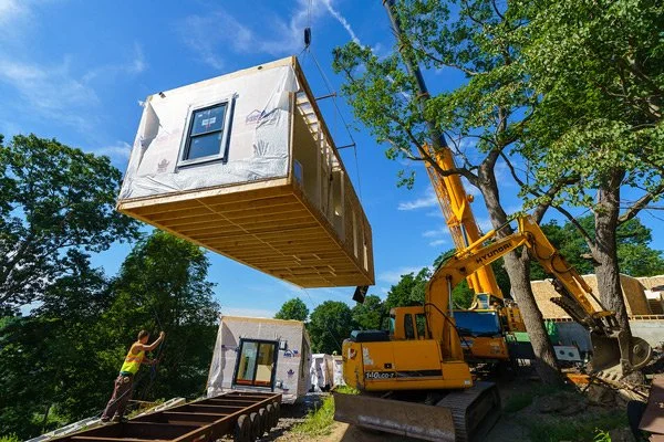
Innovative ventures such as Module Housing are reshaping the conventional landscape of home construction. Module stands out by crafting energy-efficient modular homes within factory settings and deploying them using cranes. However, Module encounters a significant challenge: homeowners are unable to visualize their homes until the delivery stage.
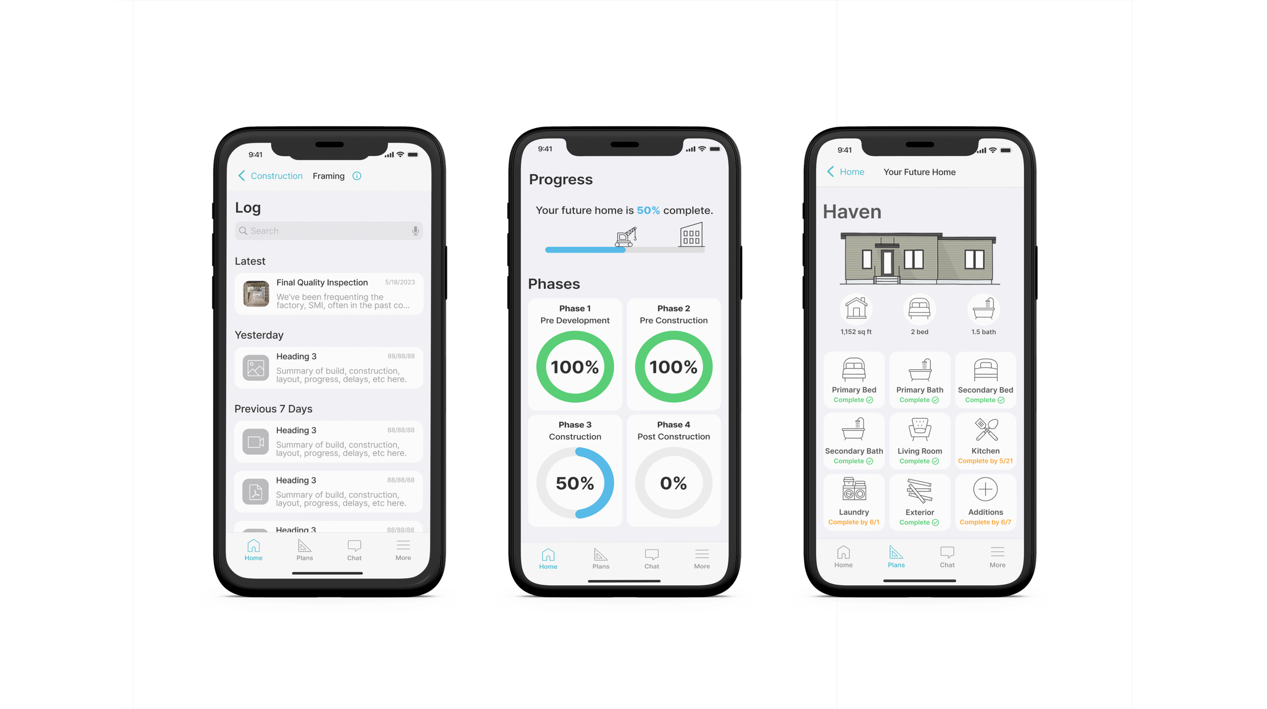
This case study illuminates the journey of crafting a conceptual iOS application for Module. The aim is to empower Module's clientele with the ability to monitor the progress of their home during the construction phase.
Context and Limitations
Our trio of designers was tasked with a tight two-week schedule to conceptualize an app tailored to aid Module's users throughout their extensive construction journey spanning several months. We embarked on this endeavor with scant knowledge about the construction sector and its demographics, and minimal interaction with Module's internal team.
Assuming the roles of UI designer and project manager, I spearheaded our efforts in navigating this project.
Research + Discovery
User Interviews
After conducting our research, we set specific criteria for our target users and proceeded to conduct six user interviews with individuals who met these qualifications.
Interviewee Criteria: Previous home buyers who have built their home before or potential home buyers interested in building a modular home.
Goal: Identify users’ personalities, problems, & motivations when building a home
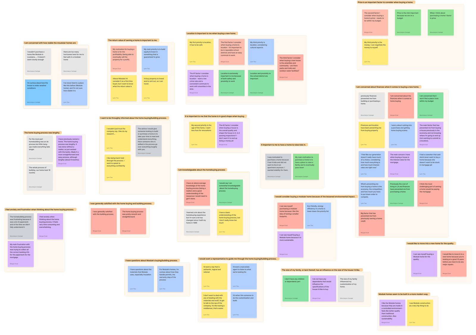
Our insights were organized in an affinity map (right) to identify the main trends of our users.
To gain an understanding of user needs, we embarked on a twofold approach. Firstly, we conducted industry research to grasp the nuances of modular housing construction and its challenges. This involved studying trends, best practices, and emerging technologies. Secondly, we conducted user interviews to gather firsthand insights into Module's clientele.
My team and I delved into Module's business operations, consolidating resources to understand their processes, target users, value propositions, and brand identity. This groundwork laid a solid foundation for our team to comprehend Module's ecosystem and design a solution that aligned seamlessly with their objectives and user expectations.
Main Takeaways
-
Priorities
Both past and prospective homebuyers consistently prioritized factors such as finances, location, size, and the potential return value of the home.
-
Transparency
Across the board, there was a unanimous desire for increased transparency throughout the home buying and building process.
-
Progress Updates
Former homebuyers who had their houses built on-site expressed a need for frequent on-site visits to track progress updates closely.
Defining Personas
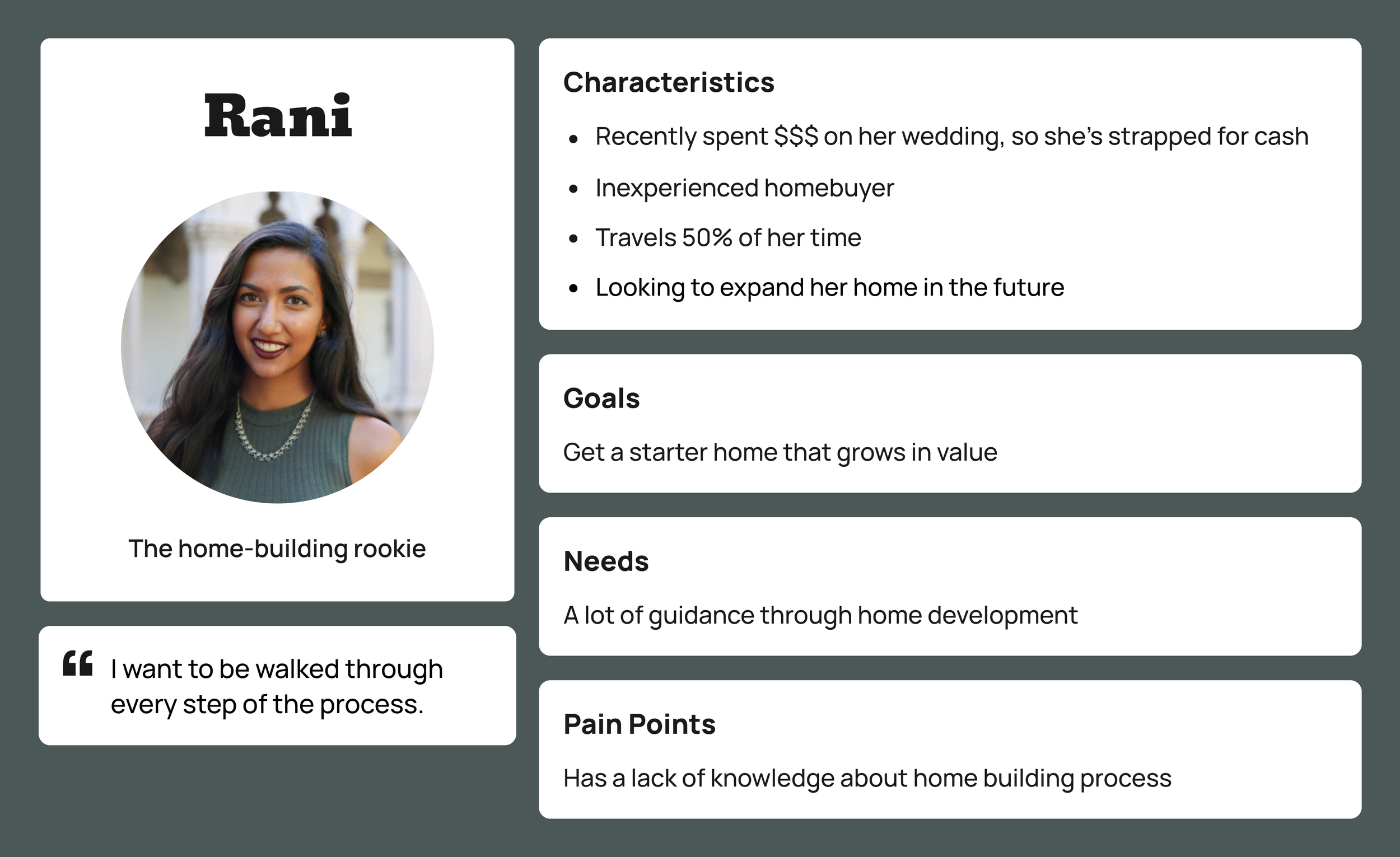
Based on the insights gathered, we developed personas named Rani and Stan to embody Module's primary clients. Throughout the ideation phase, these personas served as valuable tools to ensure that every feature in the design catered to the specific needs of our users. Take a look at their profiles below!
User Flows
As a team, we worked together to develop user flows tailored to Rani and Stan's personalities, challenges, and objectives. By establishing these user flows early in our process, we managed to steer clear of overloading the app with unnecessary features.
Design Iterations and Validations
Design Concepts and Early Explorations
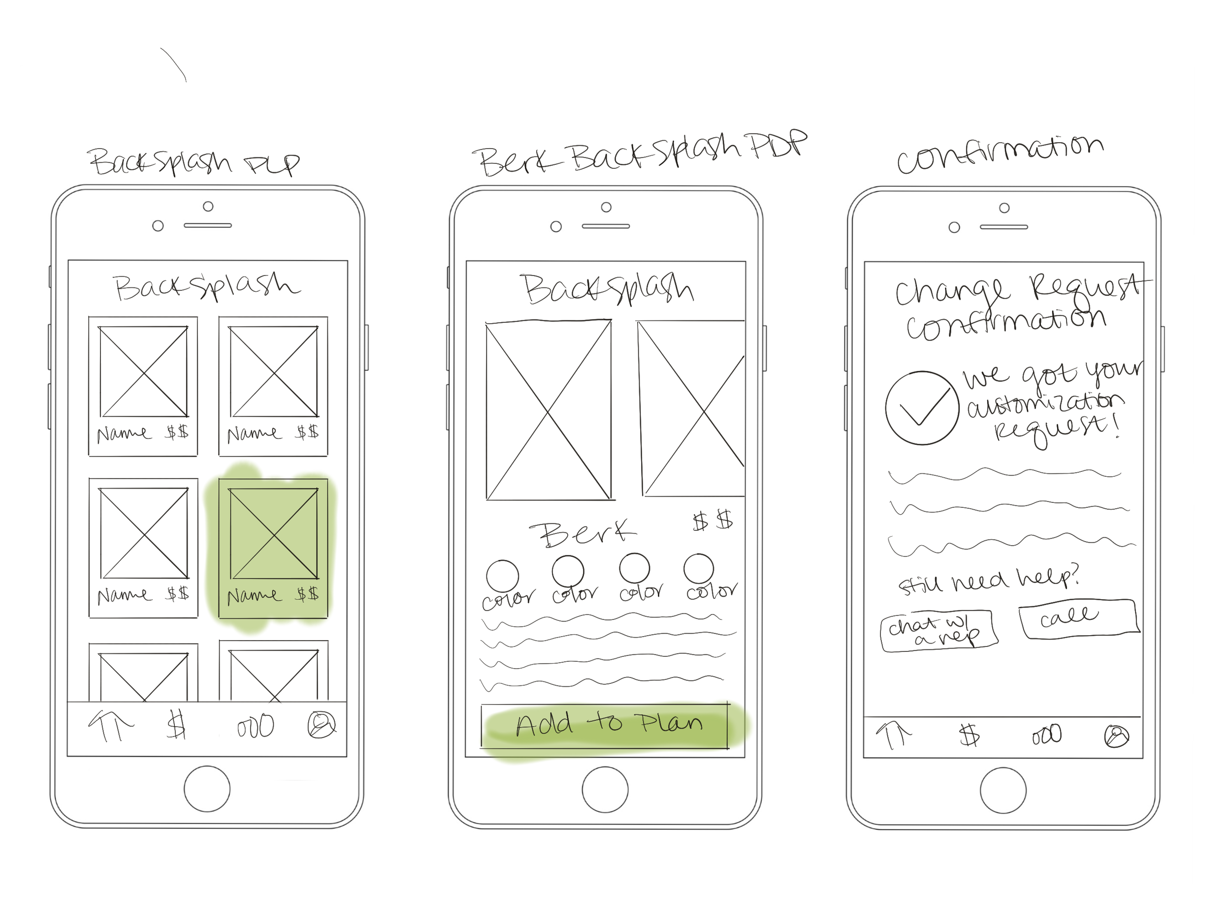
Inspired by the layout of other construction and e-commerce apps, I came up with sketch ideas to visualize solutions for users. Several features to point out in the redesigned site:
Design Studio: Sketches
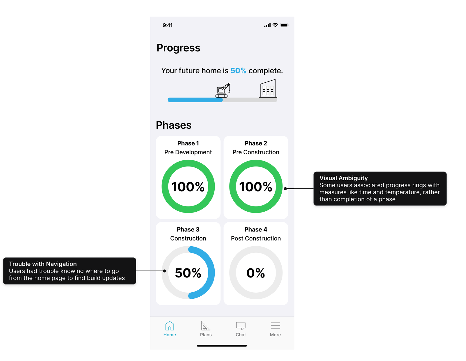
Progress Visualization
Divided by phases and visualized by percentage completed, so that users can get an idea of the progress at a glance.
Progress Logs
A log of the progress per phase, that allows the builder to provide summary updates to the client with minimal interference to their work
Chat Feature
Access to Module representatives via message, so users like Rani can have any questions quickly
Info Pages
Detailed articles on construction phases to help educate new homeowners like Rani and provide reassurance
Journey Maps
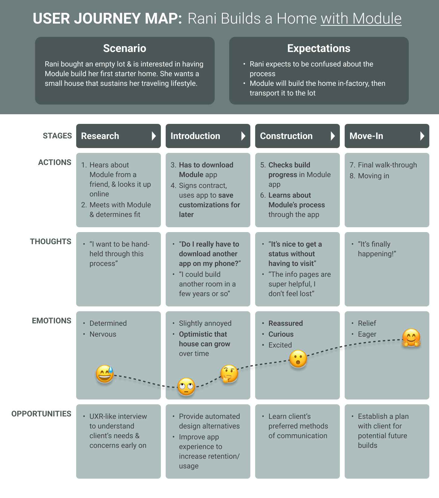
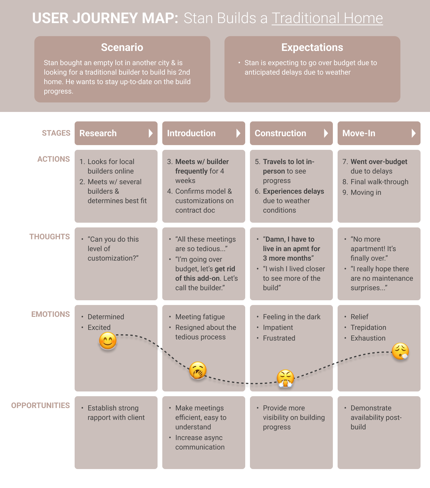
While I crafted mid-fidelity frames using Figma, my teammate focused on creating journey maps to depict the expected impact of our designs on the user experience with Module.
These journey maps comprehensively illustrated the experiences of both Rani and Stan, spanning from their initial desire to build a home to the completion of construction by Module. They effectively portrayed the users' actions, thoughts, and emotions, while also highlighting potential business opportunities.
The Final Mockup
As the deadline loomed, we made a strategic decision to align our app's branding closely with iOS standards instead of manually adopting Module's branding. This adjustment enabled us to focus on delivering a completed prototype within the given timeframe. Take a look below!
Being the iOS subject matter expert within our team, I took the initiative to gather crucial iOS guideline information for my teammates. Additionally, I established the majority of components in our Figma file, ensuring that our team could hit the ground running when creating the prototype.
Usability Testing
We allocated time to conduct usability tests on the prototype with three participants, enabling us to collect feedback and validate our design decisions. These tests uncovered significant issues with the design, prompting us to iterate and refine our approach.
Iterating Feedback
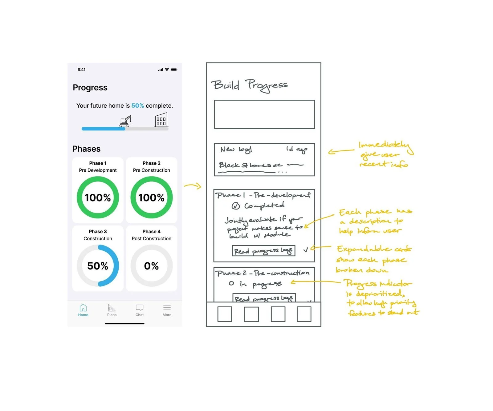
In response to the usability test feedback, I created a low-fidelity design for a theoretical second iteration.
Progress Logs First
Present recent information upfront to prevent users from needing to search for updates.
Prioritize Information
Use phase card descriptions to help users grasp the content they'll access upon tapping, with a dropdown option for users to expand details as required.
Call To Action
Clearly communicate a call-to-action to prompt users to explore progress logs efficiently.
Next Steps
Here are some additional ideas considered by our team that we opted not to pursue for the initial design. These features either didn't directly meet the needs of our personas or were deemed potentially complex for Module to implement as part of their business strategy.
Guided Finance Experience: Integrating an affordability calculator and loan consulting feature to aid clients in financing their modular homes effectively.
Scope of Customization: Exploring options with Module to potentially reduce the scope of customization based on their capabilities and client preferences.
Factory Build Live Cam: Incorporating a live camera feed for clients to observe real-time construction progress, but it was set aside due to its potential complexity.
Conclusion
This project intrigued me by showcasing how design can simplify significant life events such as home buying. It was fascinating to delve into the workings of a real startup with tangible business outcomes and fulfilling to strive for authenticity wherever possible, even amidst timeline constraints that occasionally necessitated a return to the original prompt.
Through thorough research and efficient ideation, we identified high-priority features like progress tracking and customization options. As a first iteration, I'm proud of the solution our team devised to enhance Module's home building experience for clients akin to Rani and Stan.
