Kuda Vana Partnership Website Redesign
Revitalizing Connections and Empowering Futures: UX team redesigns the website for a Zimbabwean orphanage to enhance user experience and amplify their impact.
Tools
Figma, Squarespace, Procreate, Whimsical, Notion, Trello
Methods + Approach
User Research, Affinity Mapping, Card Sorting, Personas, Journey Mapping, Competitive Analysis, Site Mapping, Feature Prioritization, Wireframing, Prototyping, Hi-Fi Mockups, Usability Testing
Client
Kuda Vana Partnership
Team
3 UX Designers
My Role
UX Designer, Project Manager
Timeline
3 week sprint
Not Your Typical Orphanage
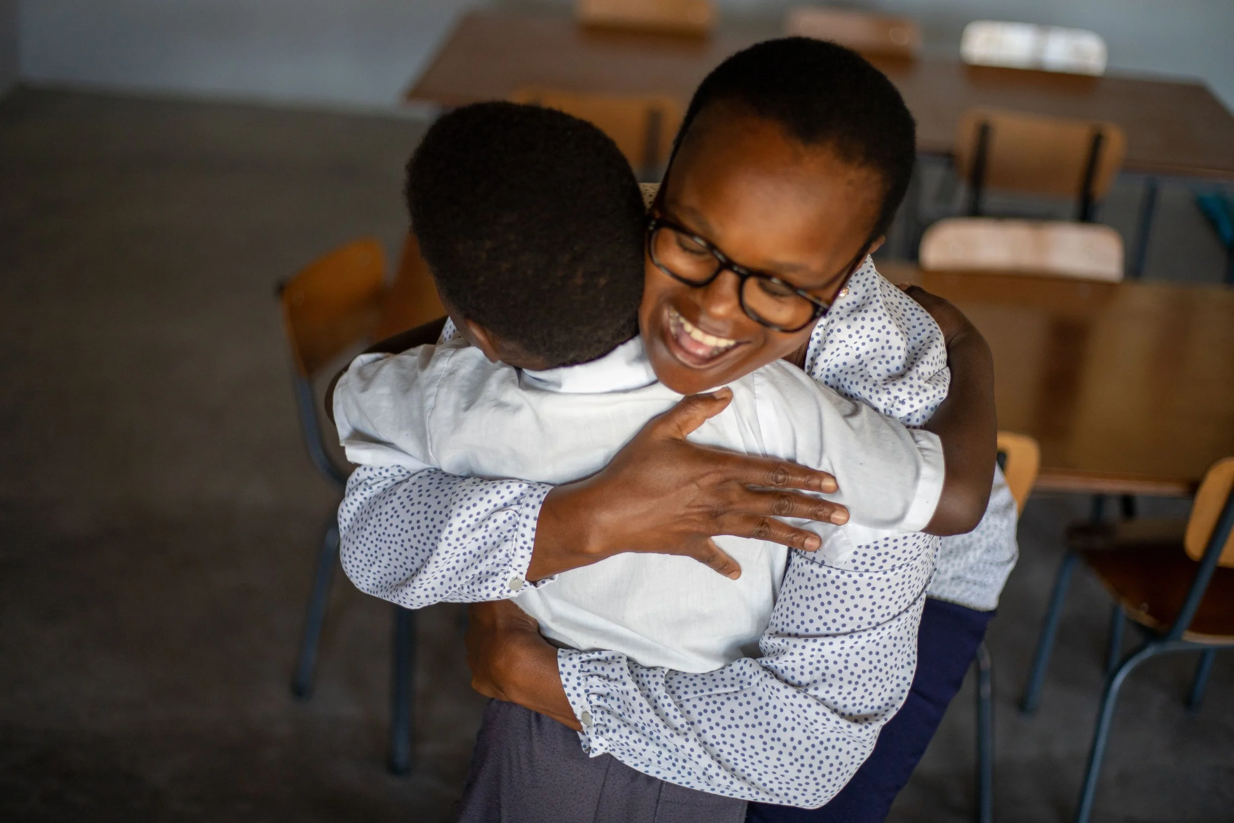
Kuda Vana is not your typical orphanage. Kuda Vana Partnership is a non-profit that seeks to not only empower the children of Zimbabwe to survive, but to thrive. The staff provides care and resources for around 50 children ranging in age from newborns up to 17 years of age. The Kuda Vana staff provides whole-person care to each child, including love, nutrition, security, healthcare, education, life skills, and spiritual and emotional guidance - enabling them to live more independent, dignified, and enriched lives.
High Level Project Goals
-
Remove Identifying Photos
Remove identifying photos of children on the website to comply with new laws in Zimbabwe.
-
Educate Donor Base
Educate audience/donors on best practices in orphan care with a focus on family reunification.
-
Cater to Zimbabweans
Cater more to a Zimbabwean population (i.e. push towards adoption/foster care page) with culturally relevant materials.
Research
Meeting the Donor Base
Our first step in accomplishing the goals of this project was to understand the needs of the user base. Since 81.2% of the current website’s traffic is coming from the US, we began by surveying the predominantly American donor base. We surveyed Kuda Vana’s most engaged donors in an effort to understand their goals and motivations in donating to the nonprofit and to identify important factors that contribute to a donor’s continued support. From a total of 34 survey responses, we were able to identify the following trends in the data:
Motivated to make a difference
Donors are highly motivated by making a difference in the lives of vulnerable children in Zimbabwe.
Emphasize financial transparency
Donors value the use of infographics and stories to showcase donation effectiveness.
Trust is key
Donors continue to support Kuda Vana because of their deep-rooted trust in their mission, staff, and financial stewardship.
Hardly ever use the website
Instead, donors keep up with the nonprofit’s current happenings from the newsletter.
A Persona Impasse
After affinity mapping survey data, my team considered how trends could inform different personas, initially focusing on infrequent and frequent donors as potential personas. However, I questioned if their needs would really be all that different and whether we had a comprehensive understanding from donor interviews alone. Intrigued by growing site traffic from Zimbabwe, I suggested shifting our attention there. I faced some pushback from my team, who were worried about how feasible and time-consuming this pivot may be. However, I firmly believed refocusing on Zimbabwean users would provide valuable insights for our redesign. For the sake of moving past this impasse, we reached out to our client for her opinion on the matter, who ended up agreeing with my idea to research Zimbabwean users. And thus, our project headed in a new direction.
Towards a Zimbabwean Perspective
We emailed a series of interview questions to 6 contacts in Zimbabwe that were either adoptive parents themselves or work as adoption advocates with Kuda Vana. Our goal was to gain a deeper understanding of the goals, motivations, needs, and frustrations that potential adoptive parents face when considering or moving through the adoption process in Zimbabwe. From the responses, we identified four major trends:
Motivated by tradition
Potential adoptive parents are spiritually and emotionally motivated and deeply value traditions and heritage.
Need access to objective information
Potential adoptive parents need access to objective information on adoption, guidance through the process, and a judgment-free zone to ask questions.
Increase exposure to adoption stories
Potential adoptive parents are more likely to pursue adoption with exposure to successful adoption stories.
Worried about cultural stigmas
Potential adoptive parents are concerned about combatting cultural stigmas about adoption and facing societal pressure from their community.
Meet the Personas
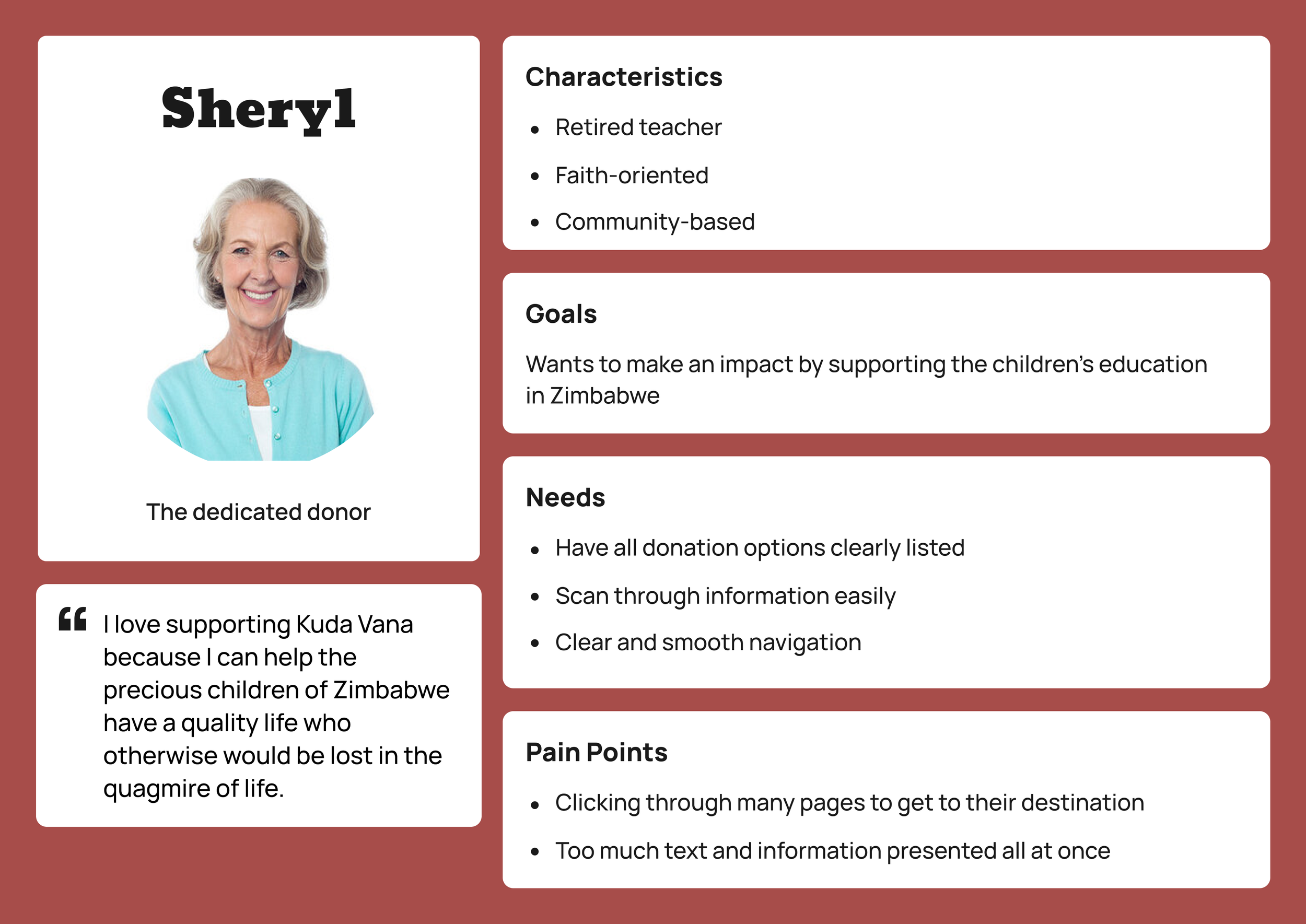
What drives donors to support Kuda Vana? What do potential adoptive parents need from a website when attempting to learn more about adoption? Our team knew this redesign would be difficult, and we needed to thoroughly understand who was visiting the site and how we could design with their wants, needs, and pain points in mind. Let’s meet our two main personas for this project:
Beauty’s Journey: A Retrospective
In this retrospective journey map, we consider Beauty’s experience in considering adoption. We start with Beauty’s several unsuccessful attempts at pregnancy, to which she eventually receives the devastating news of infertility. We follow Beauty as she confides in friends, questions traditions, and grapples with cultural stigmas in alternative options for parenthood. We end the journey with Beauty boldly deciding to go against cultural norms and pursue adoption with Kuda Vana.
Heuristic Analysis: Diagnosing Issues with the Original Site
Our team wanted to gain insight into how users navigate the original Kuda Vana site. We asked four users to complete a series of tasks on the website with the goal of understanding the needs and pain points users experience as they navigate the site. From the heuristic analysis, we were able to identify four main trends:
4 / 4 Users
Understood Kuda Vana’s mission from their website.
3 / 4 Users
Were unclear on all of the ways to support Kuda Vana
4 / 4 Users
Had trouble locating the shop when asked to buy a keychain.
3 / 4 Users
Felt overwhelmed by the amount of text on the Kuda Vana website.
Addressing User Needs
How might we address cultural stigmas so that potential adoptive parents can access objective information about adoption?
How might we make potential adoptive parents feel guided and supported as they learn more about adoption?
How might we make potential adoptive parents feel guided and supported as they learn more about adoption?
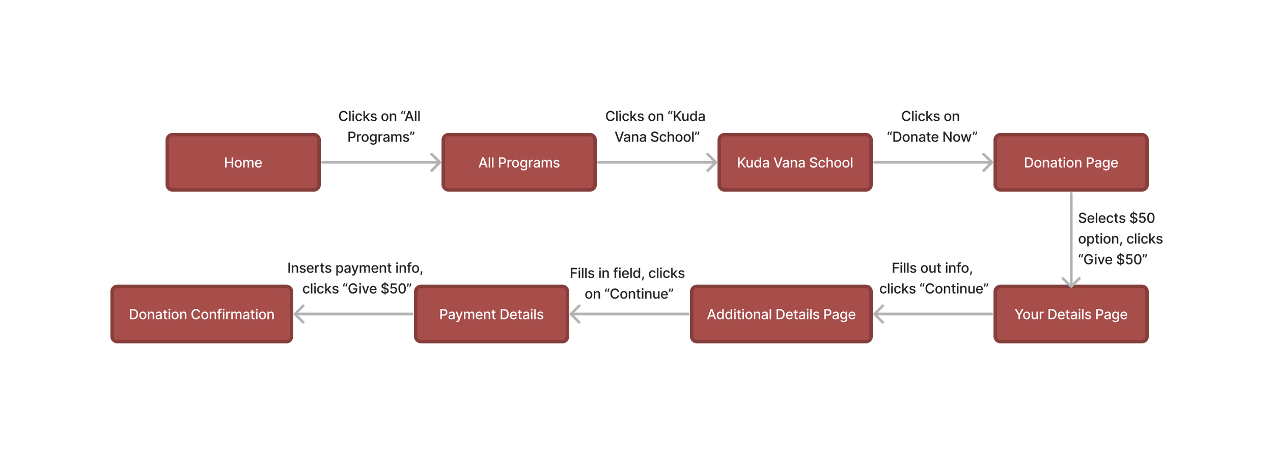
How might we clearly indicate all donation options so users can quickly decide where to direct their donations?
Design Iterations and Validations
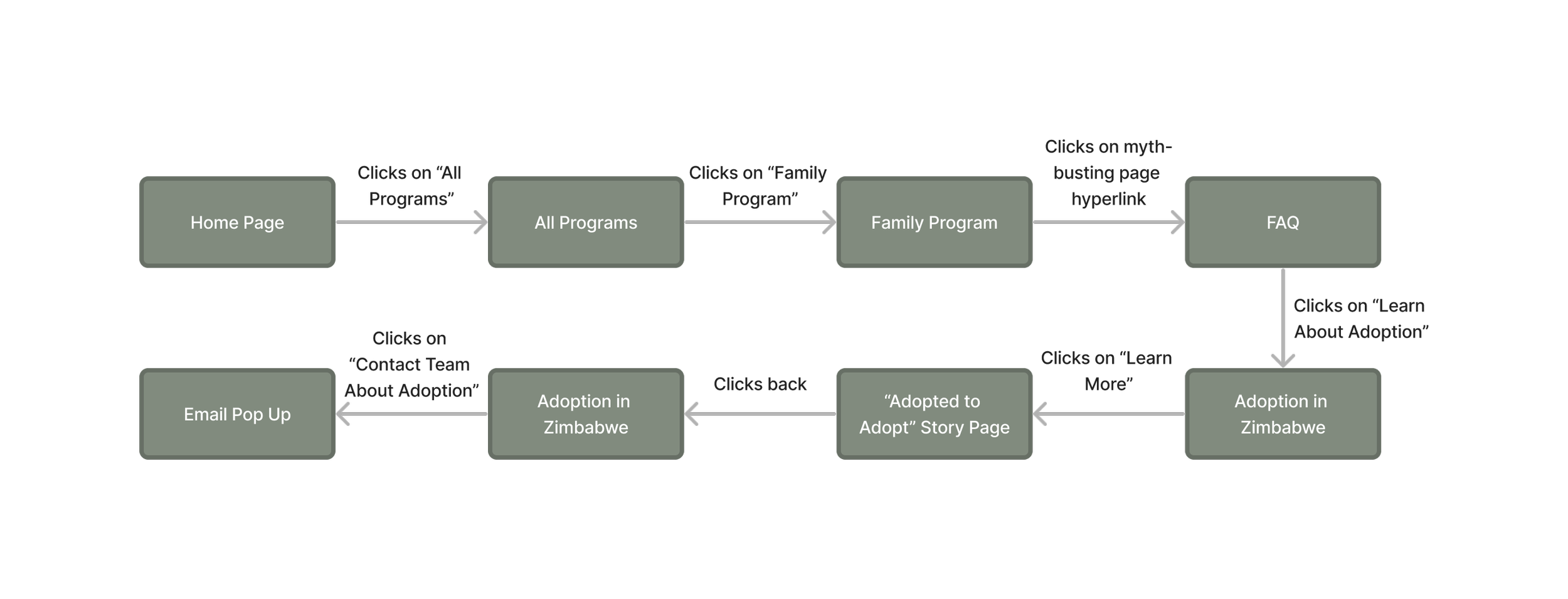
Solidifying the User Experience: Task Flows
Design Studio
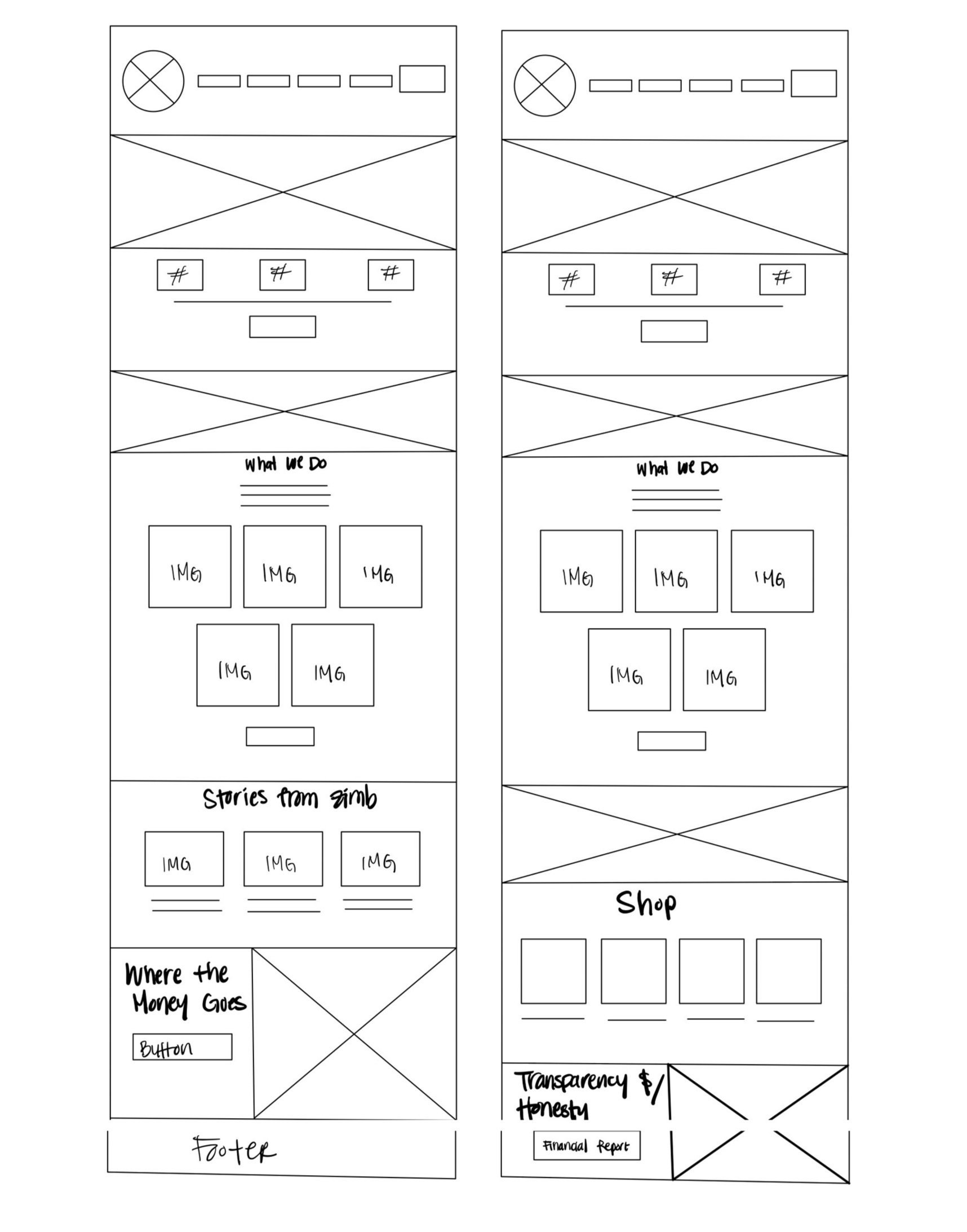
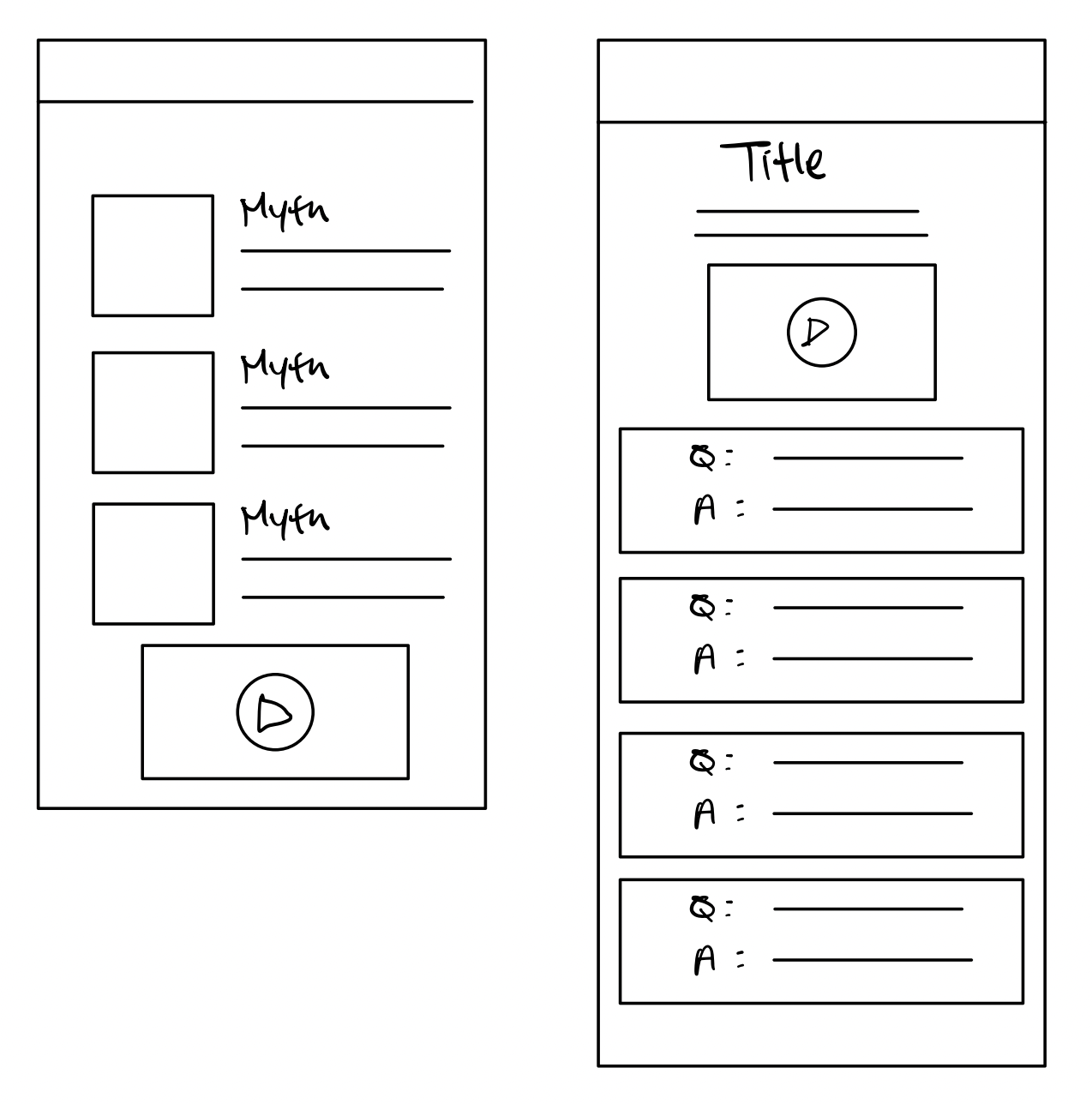
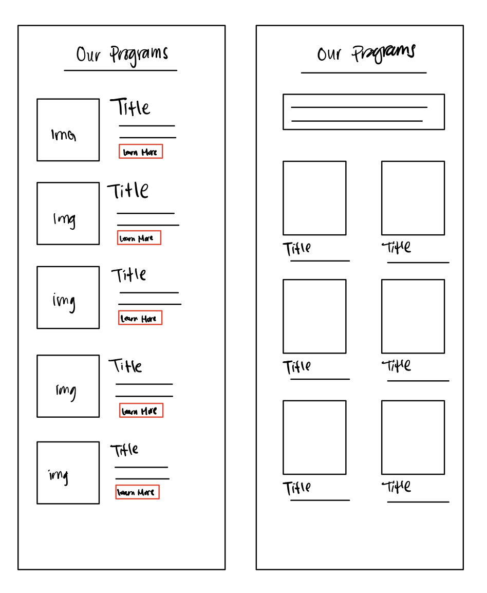
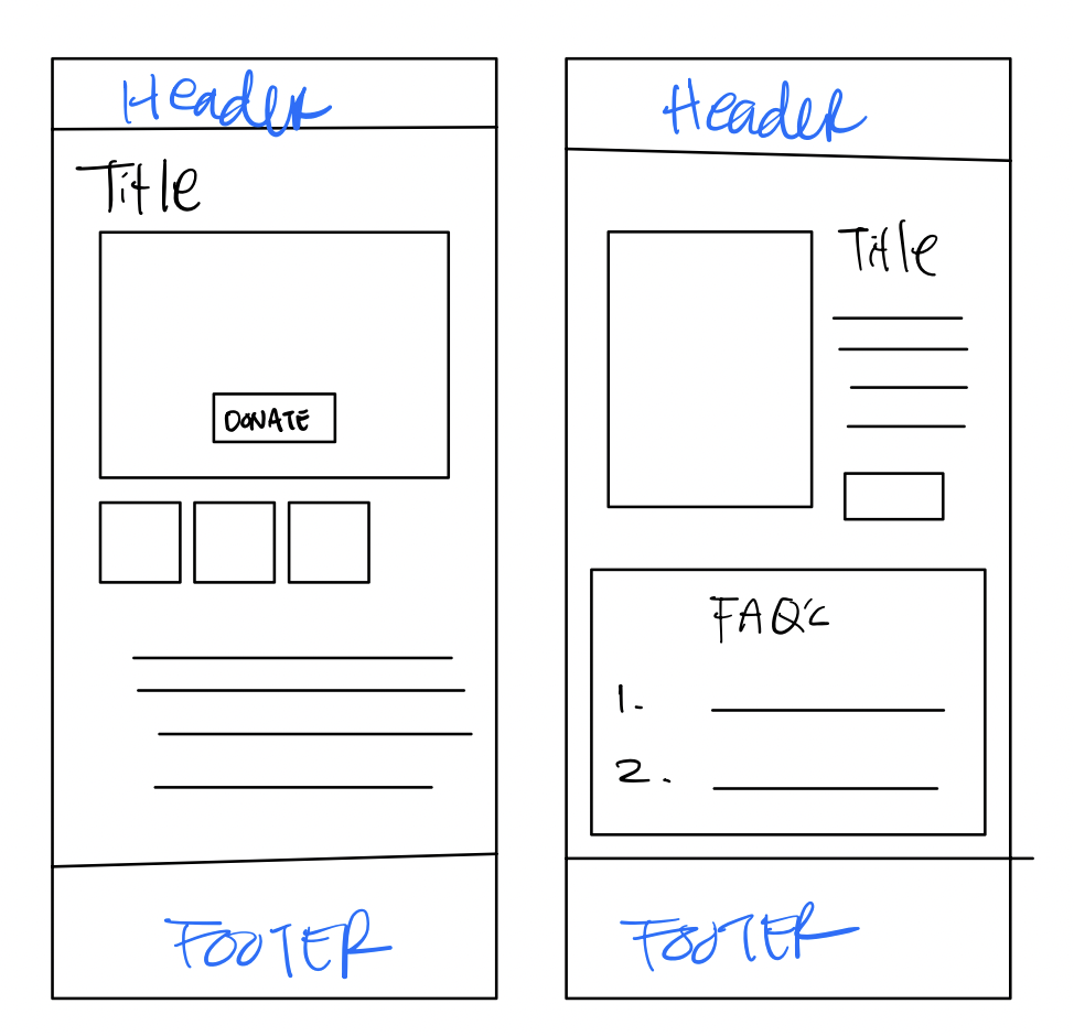
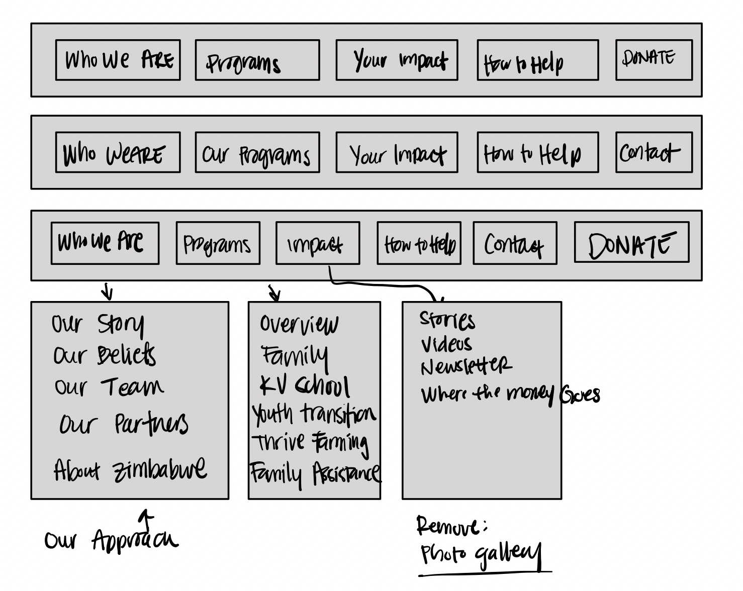
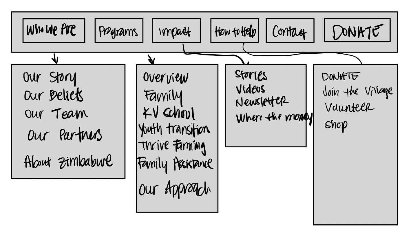
As a team, we hosted a 2-hour design studio to try to sketch as many ideas and rough designs as we could. This helped us narrow down design elements we thought would be beneficial to users and test a potential layout and navigation schema.
Home Page
Mythbuster Page
Our Programs Page
Program Page
Nav & Footer
Translating sketches into Squarespace
Highlighting the Programs
On the original website, all of the programs were laid out on one long page with a lot of text (which users were overwhelmed by in the heuristic analysis). Our client requested that we give each program its own page so that she could share each one individually with those interested in learning more. We game each program its own page in our redesign to make the information more targeted and scannable.
Addressing Myths and Cultural Stigmas
We added a page addressing myths and cultural stigmas surrounding adoption to the redesign. We hope that this page will serve to address some of the concerns of potential adoptive parents and encourage them to continue their research and consideration of adopting through Kuda Vana. We utilized accordion menus again to streamline the information, added additional educational information, and included a contact button at the bottom of the page.
Adoption Landing Page
We added an adoption landing page to the redesign with the hopes that it will be educational to donors and potential adoptive parents alike. We utilized accordion menus to reduce the amount of clutter and added related information on the page (adoption stories, videos, link to Mythbuster/FAQ page, contact button) so the user may continue their journey learning about adoption on the site. Since finishing this project, international adoption has become available in Zimbabwe, so our client has added an “international adoption” section to answer any questions regarding the topic.
Moving Shop to Primary Nav
On the original site, the shop was hidden as a subcategory under “How to Help.” Users were not able to easily locate the shop when asked to buy a keychain as a task in the heuristic analysis. Users also reported not knowing other ways to support Kuda Vana besides making a donation. By moving the shop to the primary navigation, we hope to showcase the beautiful items for sale in the shop and highlight alternative forms of support for Kuda Vana.
The Final Mockup
Validating our goals through testing
The general feedback from usability testing was positive, with minimal usability errors. The key results we identified from usability testing are as follows:
3 / 3 Users
Identified what Kuda Vana is about and why they should support their mission
3 / 3 Users
Felt the photos and other visuals were compelling and impactful
2 / 3 Users
Were confused by the “direct your support” option in donation flow
2 / 3 Users
Were taken off guard by the email pop-up at the end of adoption flow
Confusion with the Donation Flow
The biggest challenge users had was understanding how to direct their donations to a certain program in the donation flow. Each donation amount is directed to support a specific cause, but after selecting an amount, you are asked again which program you’d like to direct your donation to. Additionally, not all of the programs are listed as options, making it even more confusing. Unfortunately, we did not have time to fix this problem ourselves, but we informed our client of the problem during the project handoff.
Next Steps
Make the site mobile-responsive.
Address the confusion over the directed donations.
Do testing with donors on the new site to get their feedback.
Include the FAQ page in the navigation (currently accessed through other pages).
Find a way to keep communication within the browser when contacting the team.
Client Feedback
Client Reaction and Feedback Video
It all begins with an idea. Maybe you want to launch a business. Maybe you want to turn a hobby into something more. Or maybe you have a creative project to share with the world. Whatever it is, the way you tell your story online can make all the difference.
Reflection
This was a really great experience with a wonderful client who hit the perfect balance of giving us direction but also allowing creative freedom. My two key takeaways from this project are:
Trust Your Design Intuition
I learned how important it is to trust your design intuition and to voice your opinions when working on a team. I feel very proud of myself for pushing my idea of researching a Zimbabwean persona, regardless of the pushback from my teammates. I truly feel that by researching the Zimbabwean user base we delivered a much richer final product than if we were to only focus on the donor base.
Diversity is Key in UX Research
This project was a perfect example of why having diversity in UX research and design is imperative. Conducting user research with a diverse group of participants can provide valuable insights and help us identify the needs and preferences of different user groups. By expanding our research to include Zimbabweans, we were able to offer more tailored and effective designs that meet the needs of a wider range of users.


